In the Multimedia course final project, I made a WordPress theme based on the customizable WordPress theme: Sandbox. This is a group project and I am teamed with Ryan Kusumo. Ryan did almost all the HTML structure and structural CSS while I did the designs, assets, furnishing the looks in CSS, and JavaScripts.
Design Idea
I am not really good in design, but I do like experimenting with many things. In this project, I am using the brownish/sepia and decorative motifs in the classic-style design. However, I also want to try making a flat semi-floating design like in Google Cards. So both ideas are mixed, producing a flat-designed theme combined with classic feeling and decorations.
The pure sandbox has the formal-ordinary WordPress structure with a list on one side and sidebar on the other side. I found it to be boring. I want to make a website where all contents are scrolled fluidly, just like some modern websites. Limited by the small WordPress’ PHP codes, we hard-coded some contents on the HTML directly.
In the start of the project, I told Ryan about the ideas and gave some sketches. Then Ryan started to structure the HTML before the design is made. But of course, some adjustment is made along the work so after some of the design had been made, some HTML structure was changed again.
Assets
Both video and image assets are from my collections. I had collected some good videos and photos from the internet some time ago. Most of them are from free stocks repository, but I need to check them again for sure. Even if there are some licensed materials, I guess it is okay for now, since this is only a non-commercial, non-distributed, personal project intended for learning.
While waiting for Ryan to finish with the core HTML structure, I searched and download many free fonts and icons on the Internet, but apparently, only about 30% of them are used in the end. Some assets may not really suit the design. So, using my basic image manipulation knowledge, I edit some of them in Adobe Photoshop and Adobe Illustrator. Just some simple edits like making some transparent backgrounds, creating glitch-like shadows, and changing the hue and colour.
CSS
CSS codes that provide neat structures have been made by Ryan, so CSS codes that I made were mostly for the looks such as the colours, transparencies, drop shadow, fonts, animations, and transitions. Sometimes it is hard to find which element to edit to produce the correct results. Sometimes I need to define some new classes to suit what I intended to do. Fortunately, the beauty of CSS classes is an element can have more than 1 class to have mixed designs, so modulating the classes was easy.
Before editing, sandbox template is really plain, without colours (only some blue text as the default hyperlinks usually is). In choosing the colours, we want to make all pages and post looks the same, so we use constant colours. I used three main colours which are the #fcec83 (light tan), the #351A0D (dark brown), and #00000 (just black). The other colours are the derivate of them by changing some hue, darkness, and saturation. I usually use the online colours picker provided by w3schools. Not only for the HTML elements, the assets are also manipulated to fit the colour-pallet.
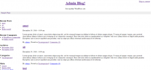
before
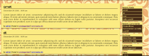
after
Most elements have flat design feels: lines, blocks, and shadow. But If you go to archives or category lists, you can found dotted lines as a little accent for the design so it feels dynamic (or is it?). Actually, there are still some design-related considerations for each element, like how fonts and background are chosen, but I will leave that for now since this is not a design course.
Finally, after most features work, we check all the pages to make sure everything is already on the right colour and proportional size. Some adjustment is made, in the CSS codes which are mostly on the paddings and margins.
There is a funny story in doing this project. My laptop has a blue-screen filter application, causing everything looks quite brownish. I accidentally selected the colours when the filter app is on. So when the app is turned off, all those colours that look good at first turned into bad pale colours. Guess a multimedia project is really a trial-and-error project.
JavaScripts
There are four main elements that are enhanced by using JavaScript.
First is the parallax scrolling menu that sticks on the top when scrolled. Looking at some reference on the internet, it was made in JavaScript by this logic: when user have scrolled to a certain value, change the menu’s CSS value by fixed, so It stops on the top. The certain value I used is the header height as the menu will stick after the header is completely scrolled over.
Second is the play-pause mechanism of the video-1 home-post, the big auto-played video in the index page. To make this element mimic a real video player is quite tricky. In the HTML structure, both play and pause icon were shown side-by-side, but when the page first loads, all buttons must be hidden or shown in these scenarios:
- If the video is playing, all symbols and text is hidden. While in this state, if use hovers mouse onto the video, the pause button is shown for a while and is hidden again to not hinder the video. If user clicks on it, the video will be paused
- If the video is paused, the video description and play button is shown permanently. If the user clicks on the video, the play button hides and the pause button appears for a while before all elements on top on the video hide again.
This element probably has the longest JavaScript codes and involves three functions and four events. This one is my favourite and thanks to it I learnt JavaScript tricks quite a lot.
Third JavaScript is for the multi-image post where the images’ description appeared only if the mouse hovers on each image. At first, I thought it can be made by using simple CSS animation, but it cannot. Because the logic behind it is when the mouse hovers on an element, another element appears. In CSS only the hovered element can change. This element was made by combining some CSS, HTML, and JavaScript tricks
Fourth is the slideshow. I learnt this slideshow from w3schools site, and modify the code a little bit so as image changes, the description linked to it also change.
Ending
This three-months Multimedia project has finally come to the end; this blog post is the final report. Although it is not really good in the terms of design and WordPress theme standards and rules, we learn a lot of HTML, CSS, and JavaScript tricks from it.

